Reports
The Operating reports provide different lenses into your data
Written By Matti Parviainen
Last updated 11 months ago
Project portfolio
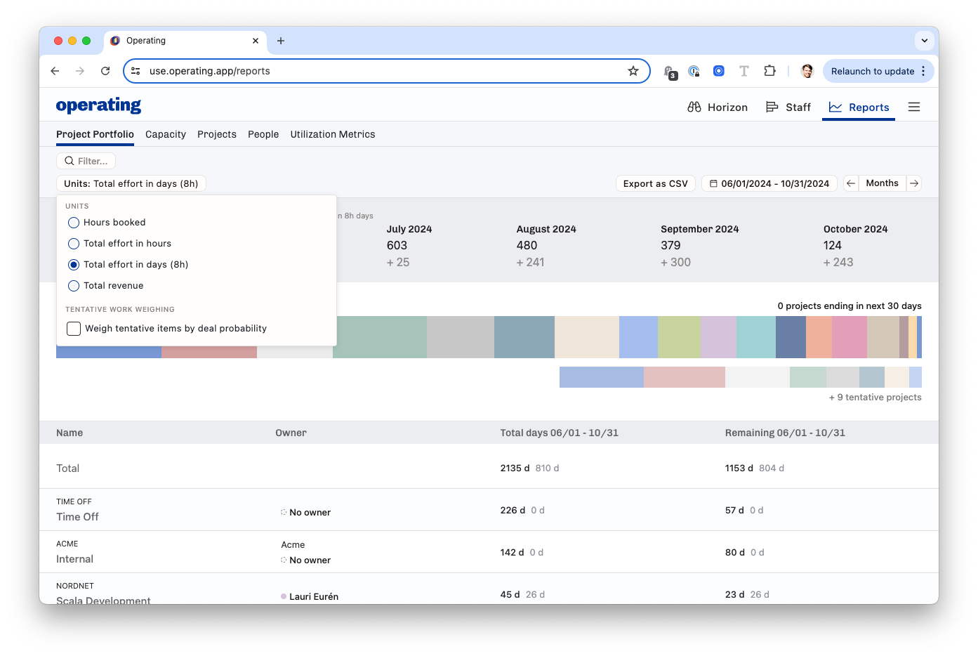
The high-level overview of everything you have planned. This report shows total effort in hours by default, giving you a big KPI of how much many hours you have in the future.
Any filters you apply will affect the results. It’s a good idea to look at different sites, groups, etc. through this lens.
Wherever we show two numbers side by side (in black and grey), they mean confirmed and tentative.
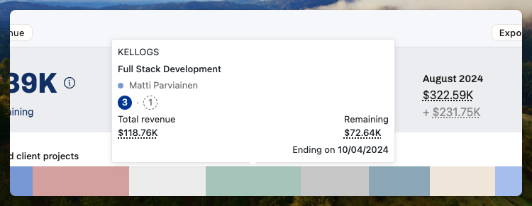
Revenue forecasting beta feature: If you choose the Total revenue as your unit of choice, you may see numbers underlined with a dash. Hover over to see what conversions or estimations have been made to calculate the figures.
Hover over the blocks to see a summary of your biggest projects.
If you choose to export the report as CSV, you will get exactly what you see on the screen. All filters, units, and other settings are exported as you’ve set them.
Capacity
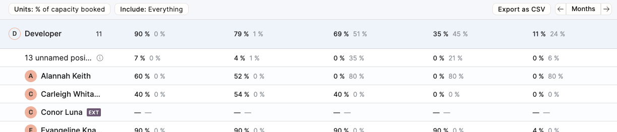
This report shows you how booked your people are.
Again: when you see two numbers side by side (in black and grey), they mean confirmed and tentative.
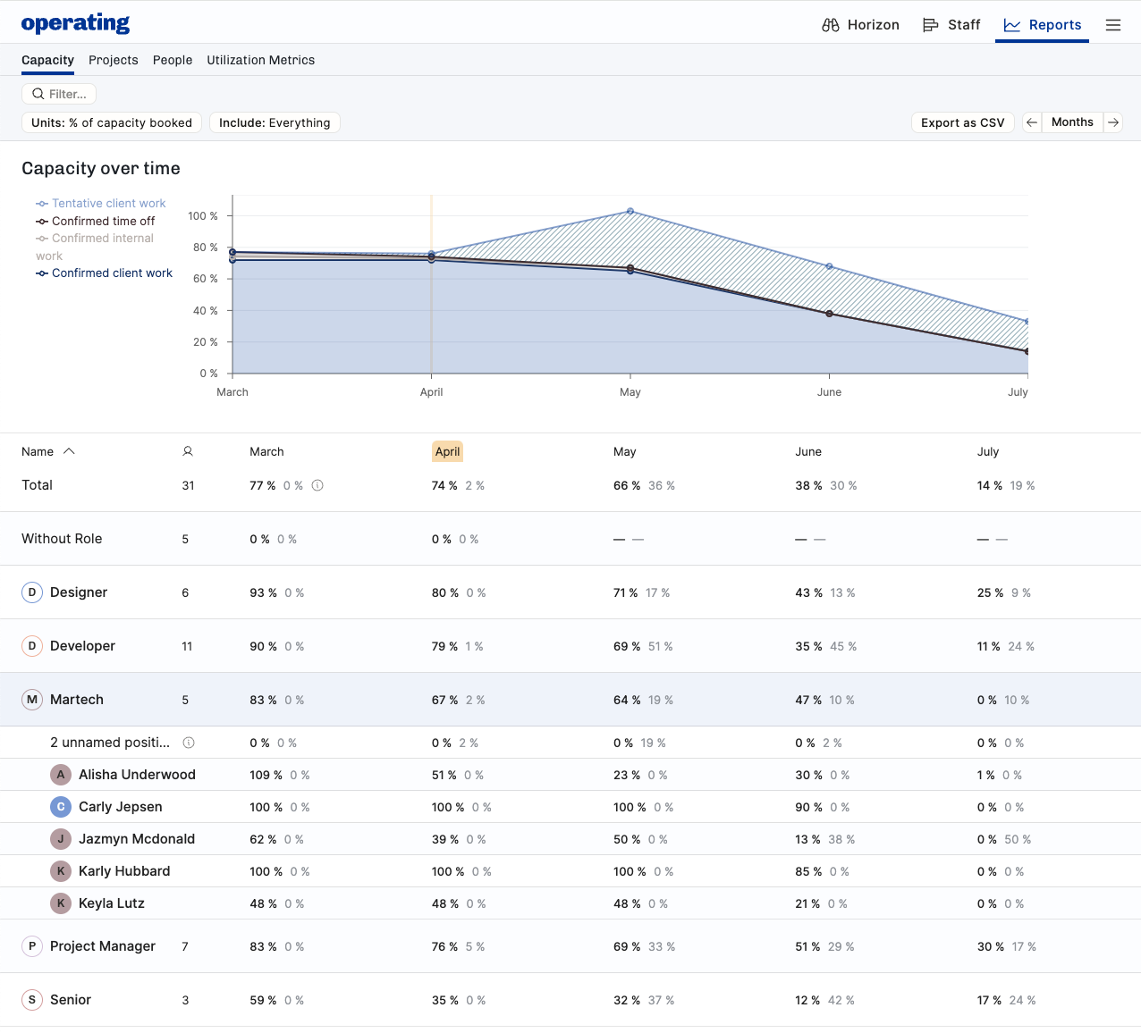
Use cases for the Capacity report:
See how booked everyone is – per role, per group or individually
Same, but through availability rathen than bookings (select Units: capacity % / hours available)
See which Roles (e.g. competences) are fully booked now and into the coming months – it might be time to hire more!
Compare different groupings and their capacity situation (use the Include menu to pick which groupings to display)
Good to know about the Capacity calculations:
The “hours booked” is the best way to look at all of your bookings – your own people and externals, combined
The work for unnamed positions – confirmed or tentative, assigned to a role, not a named person – is visible on the top row, and the % is calculated from the grouping’s capacity. In the image below, from the total of all developers.
Externals’ time appears as 100% or as “not available” because you don’t really know how much availability they have
If you choose to export the report as CSV, you will get exactly what you see on the screen. All filters, units, and other settings are exported as you’ve set them.
Projects
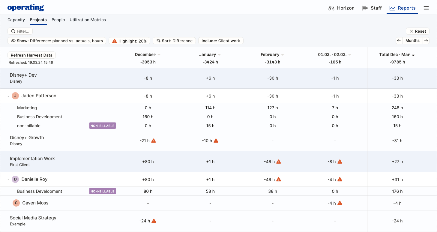
Here you see an example of a project going well – Disney+ Dev is on track, Jaden is working there. The differences between time planned in Operating and actual hours tracked in the time tracking system are inside the 20% threshold and no warning signs are visible.
The Implementation work project is not going all that well. Danielle’s February is 46 hours less than planned. Over the whole project, it’s not that bad – the entire project is +27h during December-March.
If you choose to show Planned and actual hours, or Actual hours only, please note that we rely on the time tracking data you have. It may be incomplete or wrong. Typically, the most recent days’ time entries are still missing from the system because people only fill their timesheets when they absolutely have to.
Revenue beta feature: If you show the report in revenue, we use the best information available to get the value of the work done. Your rate cards may be set perfectly, or you may have some rates defaulting back to the global base rates. The actuals that come from your time tracking system may actually have other prices related to them – we don’t import those in the time entry data. Needless to say, this is beta.
People
Video: the planned vs. actuals
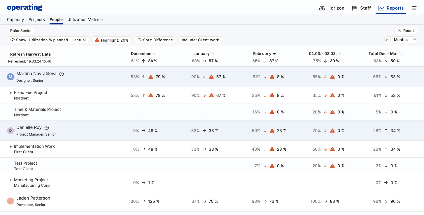
The planned vs. actuals is also interesting on a individual level, for the consultant themselves, for team leads, and HR.
Filtering is key here – in the above example, we’re zooming in on the Role Senior.
Martina’s December was over plan because Nordnet project took so much of her time. In January, it was the other way around – from 90% planned to 67% tracked.
Depending on your company’s standards, 20% difference between plan vs. actual might be right, or maybe it’s too tight or loose. Adjust the highlight setting to your liking.
Often, the reason for not following the plan might be due to internal work or time off, e.g. sick leaves. Use the include options to show all of the things you want to see.
Utilization metrics
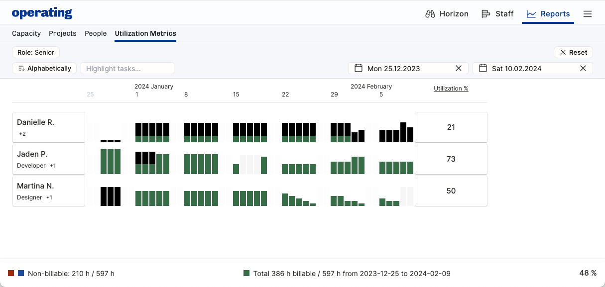
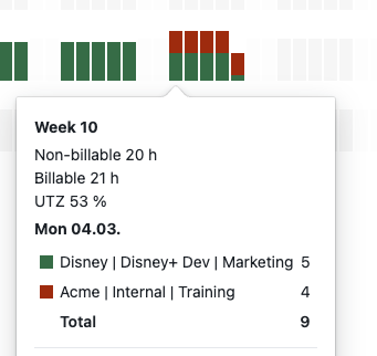
The day-by-day breakdown of what the time entries contain can be useful to understand the details of a person’s workweek in hindsight.
At a glance, notice green billable time and black uncategorized non-billable time
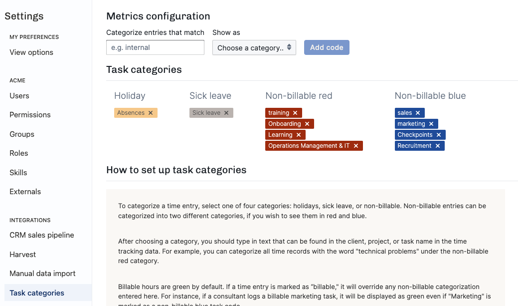
Use the color-codings in Settings > Task categories to distinguish between different kinds of tasks – see example here:
Hover over a day to see more info: